
The Hidden Language of Shapes in Logo Design
- Alain Junior Charles
- Apr 9
- 4 min read

Logos are the visual embodiment of a brand’s identity, and every element within them conveys meaning. Among these elements, shapes play a vital role in communicating messages and influencing perceptions. From the curves of a circle to the dynamic angles of a triangle, each shape carries a unique psychological and emotional weight that can define how your brand is viewed.
Circles: Unity, Trust, and Completeness
What They Represent
Circles are known for their smooth, unbroken lines, symbolizing unity, harmony, and protection. They often evoke feelings of friendship, community, and wholeness, making them an excellent choice for businesses aiming to project reliability and trust.
Where They Work Best
Community-Oriented Brands: Organizations that value collaboration and inclusivity.
Health and Wellness: Companies focused on care, empathy, and natural solutions.
Tech Firms: Innovative technology companies can use circles to imply seamless integration and user-friendliness.
Squares and Rectangles: Stability, Reliability, and Professionalism
What They Represent
Squares and rectangles convey balance, order, and security through their uniformity and straight edges. These shapes create a sense of trustworthiness and stability, often used by brands that emphasize structure and dependability.
Where They Work Best
Financial Institutions: Banks and accounting firms benefit from the stable and secure impression these shapes provide.
Legal and Corporate Services: Companies that wish to project strength and reliability.
Retail and E-commerce: Retail brands can use these shapes to imply a consistent and reliable shopping experience.
Triangles: Dynamic Energy and Direction
What They Represent
Triangles are powerful shapes that suggest movement, innovation, and focus. Their sharp angles and directional lines make them dynamic, often associated with progress, innovation, and ambition. The direction in which a triangle points (up, down, or sideways) can also subconsciously influence perceptions—pointing upward can suggest stability and reliability, while an upward angle might imply ambition and growth.
Where They Work Best
Tech Startups: Brands looking to position themselves as innovative and forward-thinking.
Sports and Fitness: Companies that emphasize motion, agility, and success.
Creative Industries: Businesses that thrive on energy and innovation.
Organic Shapes: Flexibility, Creativity, and Approachability
What They Represent
Organic shapes are less formal and more free-flowing. They evoke an organic feel, reminiscent of nature and the human touch. These shapes are ideal for brands that wish to project creativity, empathy, and a sense of individuality.
Where They Work Best
Creative Agencies: Design and advertising firms can use organic shapes to convey creativity and innovation.
Food and Beverage: Brands that pride themselves on natural ingredients and artisanal quality.
Lifestyle Brands: Businesses that promote a balanced, approachable lifestyle.
How to Choose the Right Shape for Your Logo
When selecting a shape for your logo, consider the following factors:
Brand Personality: Align your shape choice with your brand’s character—formal, fun, innovative, or trustworthy.
Target Audience: Understand the values and preferences of your target audience. A well-chosen shape can create an instant connection.
Industry Norms: While it’s essential to stand out, being aware of industry-specific design conventions can help you choose a shape that resonates with customers familiar with your field.
Versatility: Ensure that the chosen shape works across various mediums—be it digital, print, or merchandise. It should look great on both large and small scales.
Real-World Examples
Global Brands
1. Pepsi – Circle with Dynamic Wave
Shape: CircleSymbolism: The circular shape evokes unity, global reach, and friendliness. The internal wavy design adds movement and energy, reflecting a youthful and refreshing brand identity.
Why It Works:Pepsi’s round shape paired with bold red, white, and blue colors helps the brand feel familiar and dynamic across all markets. It also subtly resembles a globe—perfect for a worldwide beverage brand.
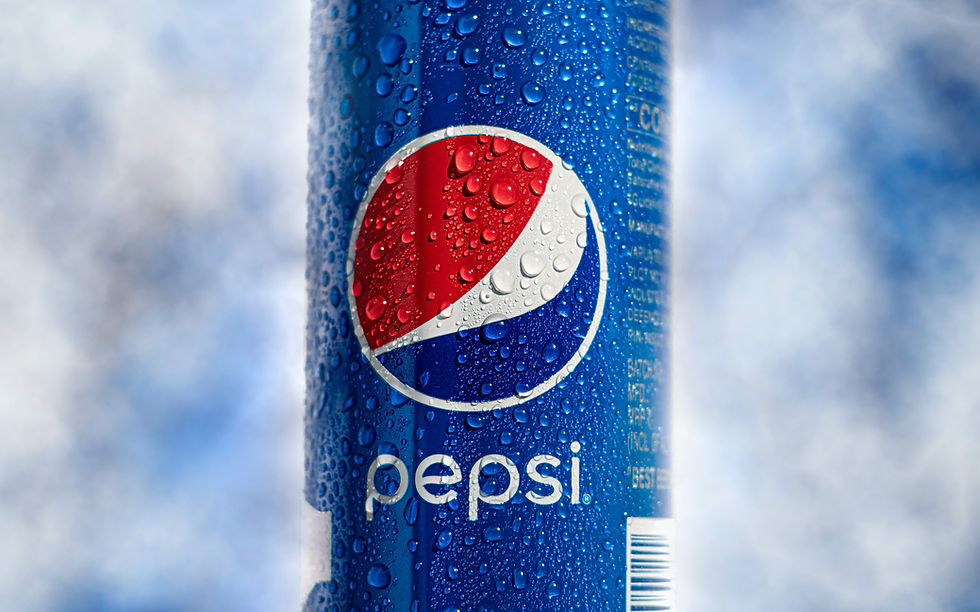
A close-up shot of a cold, refreshing Pepsi can covered in condensation against a blurred background. 2. Dropbox – Squares and Rectangles
Shape: Squares/Rectangles (transformed into an open box)Symbolism: Squares represent security, structure, and reliability. The open box design suggests openness, flexibility, and innovation.
Why It Works:The logo communicates that Dropbox is a safe and well-organized space for your files, while the visual “box” remains simple and iconic for digital platforms.

A smartphone displays the Dropbox app logo on its screen, placed on a wooden table next to a closed notebook. 3. Delta Airlines – Upward Triangle
Shape: Triangle (pointing upward)Symbolism: Strength, movement, progress, and ambition. An upward-pointing triangle often suggests ascension and reaching new heights.
Why It Works: Delta’s triangle shape not only ties into the Greek letter delta (Δ) but also subtly communicates the idea of flying and elevation, which aligns perfectly with an airline’s goals.

A Delta airplane is prepared for departure on a snowy day at the airport, showcasing winter conditions as ground crews work nearby amidst light snowfall.
Bring Your Brand to Life
Understanding the psychology behind shapes in logo design is the first step toward creating a memorable brand identity. Whether you're reinventing an existing brand or launching a new one, selecting the right shapes can significantly influence customer perception and convey your brand's core values effectively.
Ready to design a logo that speaks volumes about your brand? Contact us today for a free consultation, and let’s transform your ideas into a compelling visual identity that captures your unique story. Your brand’s journey starts here—let us help you make it unforgettable.
Interesting...Thanks Fast!
Thank you